

I can’t tell you why I thought it would be a good idea to tear out our only full bathroom with a newborn baby and a grubby three year-old in the house. Probably because I thought it would be a quick project.
Or maybe it was because I hated the shower with a passion so fierce that I plotted its demise every time I attempted to bend over and scrub my feet, only to end up hitting my head in the tiny space.
Or perhaps because we’d recently redone all the electrical and plumbing in the house and I figured the holes we’d punched in the bathroom walls should be patched. And if I was going to go to the trouble of patching walls, then I should make the space into a place I liked.
Which probably explains why I got out the sledgehammer instead of the plaster patching kit.
Here is the layout:


To be fair, the bathroom had a few lovely features: the classic black and white floor tile and a tub with nice clean lines.

At one point the walls were pepto pink, based on the color underneath the tiles.

But the sink was old and there was no place to store bathroom accessories. Plus, the mirror over the sink was low enough that Chris had to bend at the waist if he wanted to actually look at his reflections. Plus we had the giant holes in the wall.
It was also serving a family of four and I can’t tell you how many times I complained about Chris taking forever to wash his face. I love the man but he is a serious sink hog.


I did all the demo, first removing the sink and toilet, and then, finally, attacking the dreaded shower.
From the shower alone, we removed approximately 1,000 pounds of material, including a massive concrete floor slab. Here we are down to the studs. Looks like there was a bit of a leak at some point, although the wood underneath was in great structural shape.

And then, in a move I still regret, I chickened out on rebuilding the shower and hired it out to a local contractor. Waterproofing:

Beginning tile:

Frankly, I don’t think the guy did a very good job. His attention to detail was lacking and he put a number of scratches in the brand new shower floor. No bueno.
Granted, this is an old house. Tile is tough because it so badly wants a perfectly square and plumb space. And that simply isn’t the case with 100 year-old houses. They’re a bit like people: they sag in various places.
But I’m still convinced he put in a few wonky s-cures in there, just for good measure. It’s a hot mess.

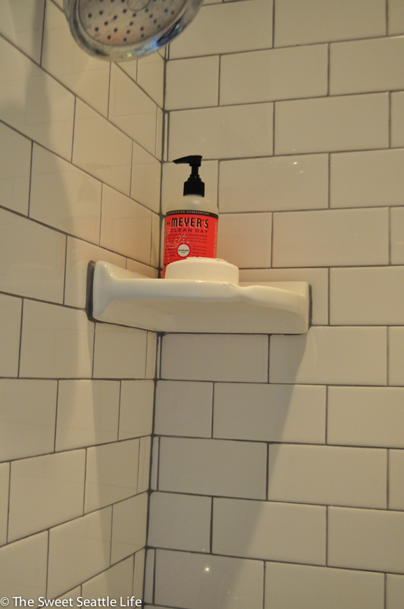
So we declined to have him do the tub and instead I got to try my hand at wall tiling. This was a first for me. You may remember that I did a tile floor in our laundry room and I was pretty thrilled with the results.
But this space is a lot more difficult.
First up, it’s vertical, not horizontal. Secondly, nobody looks at floors whereas you look at the tub tile every time you plonk down on the toilet for some private time.

And thirdly, the tub had settled 1.5 inches in the back corner. Trying to make that up with tile is just about home reno suicide.


And then it was time for the vanity. I probably spent weeks of of my life looking online for a double vanity that would fit our very narrow space. And I wasn’t finding anything.

Until we took a quick trip to Ikea and found this beauty. Chris was sold but I hemmed and hawed a bit because it has a distinctly modern look. I’ve seen houses that are an awkward combination of multiple styles and I was worried the 1930’s era plus modern scandinavian mash-up wouldn’t work.

I painted two furniture legs white and they added a little traditional touch that I think works well with the space. I like the ash color too, as I think it adds some slight warmth to what is a fairly cold space.


We also had the tub professional repainted, which made a huge difference. No more stains and chips. It’s gorgeous. We had it done right before we went out of town so it had a few days to de-fume itself.


To be honest, there are a few things I wish I’d done differently. The biggest one is the grout color. I love the traditional look of subway tile with light grey grout. It’s classic.


Secondly, as much as I like the style of the floor, I’m not sure I should have kept it. It’s in rough shape and looks grubby. The cream grout is stained and chipping. I’m going to have it professionally stained and sealed in an effort to improve the overall appearance but I’m not terribly optimistic. It’s going to have to be one of those features I embrace as ‘character’ in this grand old house.

And lastly, I love the vanity but there are two problems with it. The first is that the sink is really shallow and our faucets aren’t tall enough. It would be nice to have had a bit more wiggle room when washing hands and faces. That’s a small issue.
The second is that the drawers are huge and extend across the entire length of the vanity. So if one person is washing their face, a second person can’t reach into a drawer to get toothpaste without the first person moving. It looks like Ikea has addressed that issue with their updated vanity line.

Lovely white tub. Emma has been in heaven.

In trying to keep the historic feel of the room we added period lighting with these old-looking school house lights from Restoration Hardware. It was a total splurge for us but I adore their stuff. We’re gearing up for our kitchen remodel and I’ve got my eye on two of their hanging pendants.

Sadly, here is another instance of old school and modern colliding. Old looking light, new fan/heater. This room didn’t have any ventilation previously though so I’m not complaining.

And that’s a wrap.

xo,
Sonja